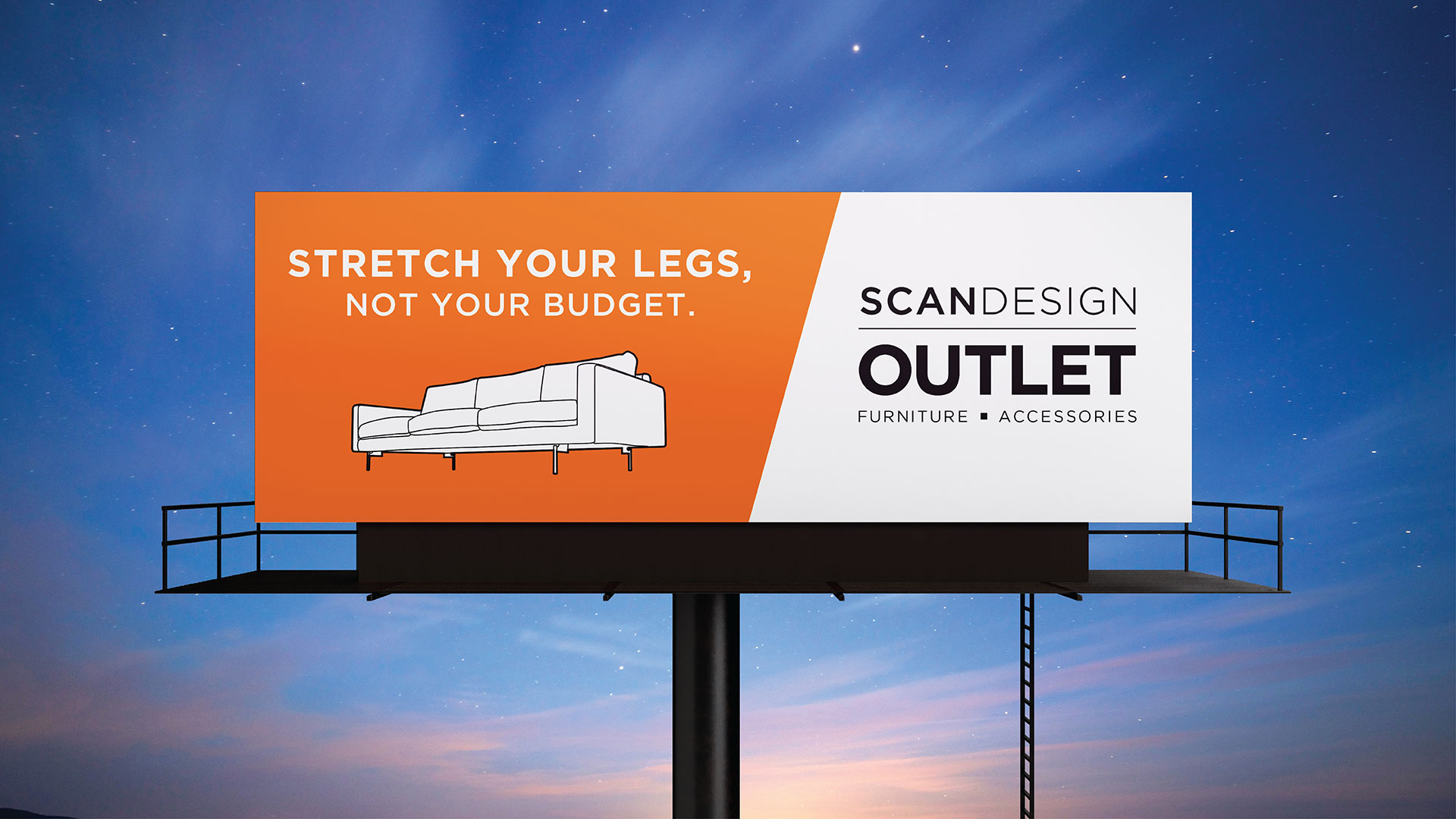
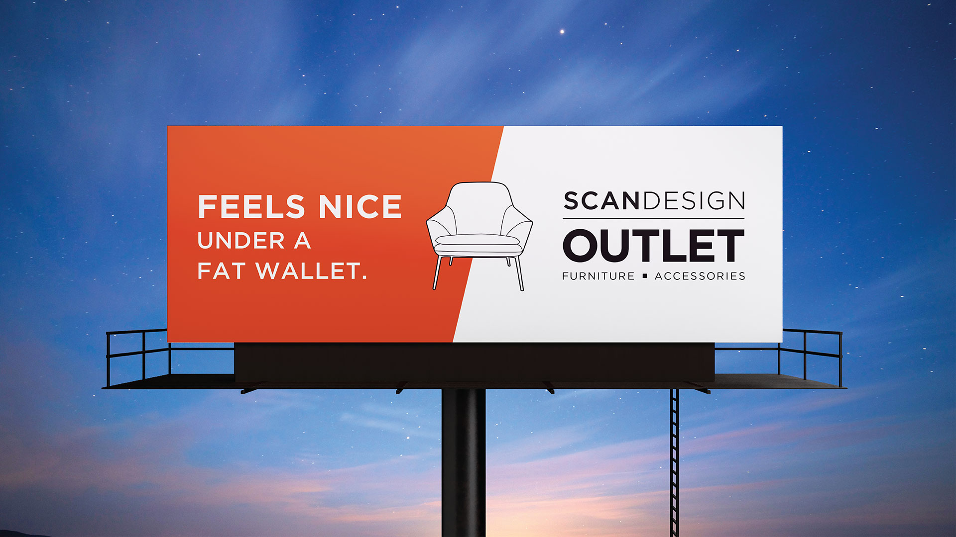
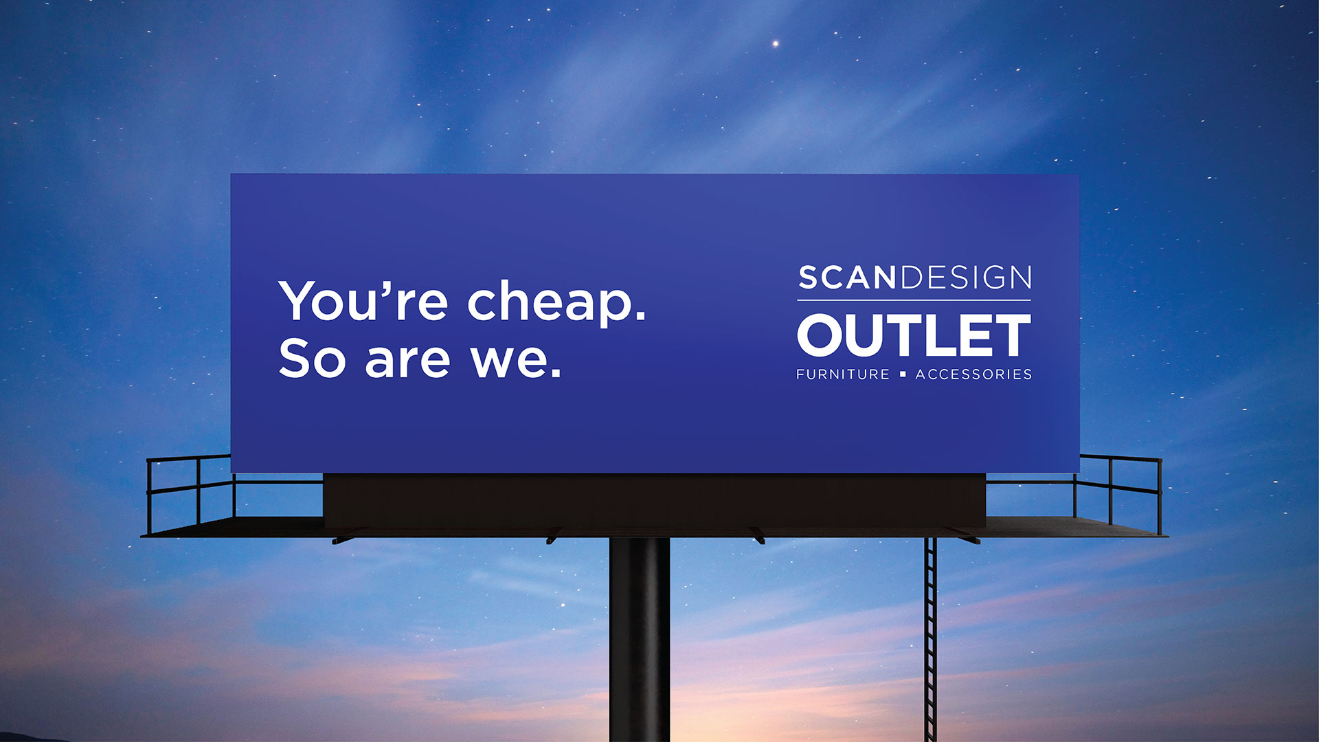
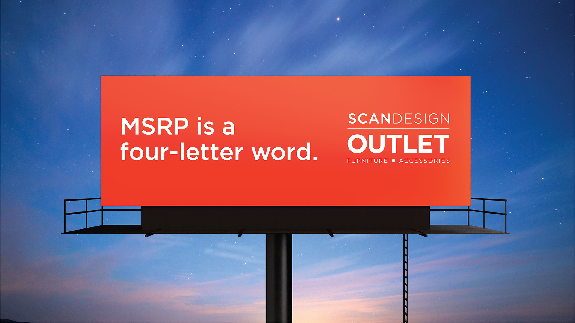
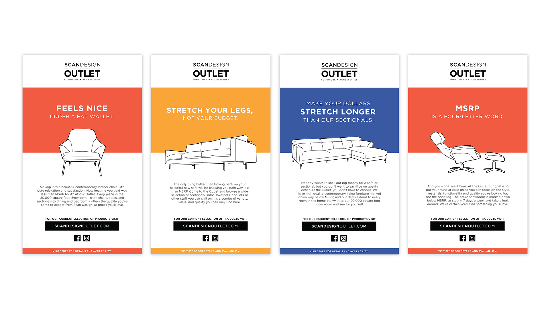
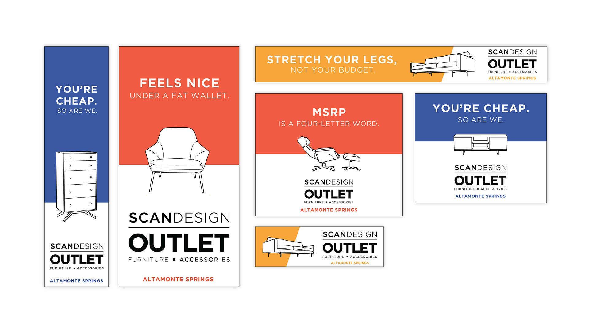
People hate paying full price. We know it. You know it. Scan Design knows it. For our integrated campaign for the Scan Design Furniture Outlet, we wanted to lean into the psyche of the outlet shopper who expects a bargain but still wants luxury quality contemporary furniture. We also wanted to speak directly to this customer, and in some instances call out their frugality as a smarter-than-the-other-guy consumer quality vs. something to be ashamed of. Embrace the deal!

Scan Design Furniture Outlet – More for Less
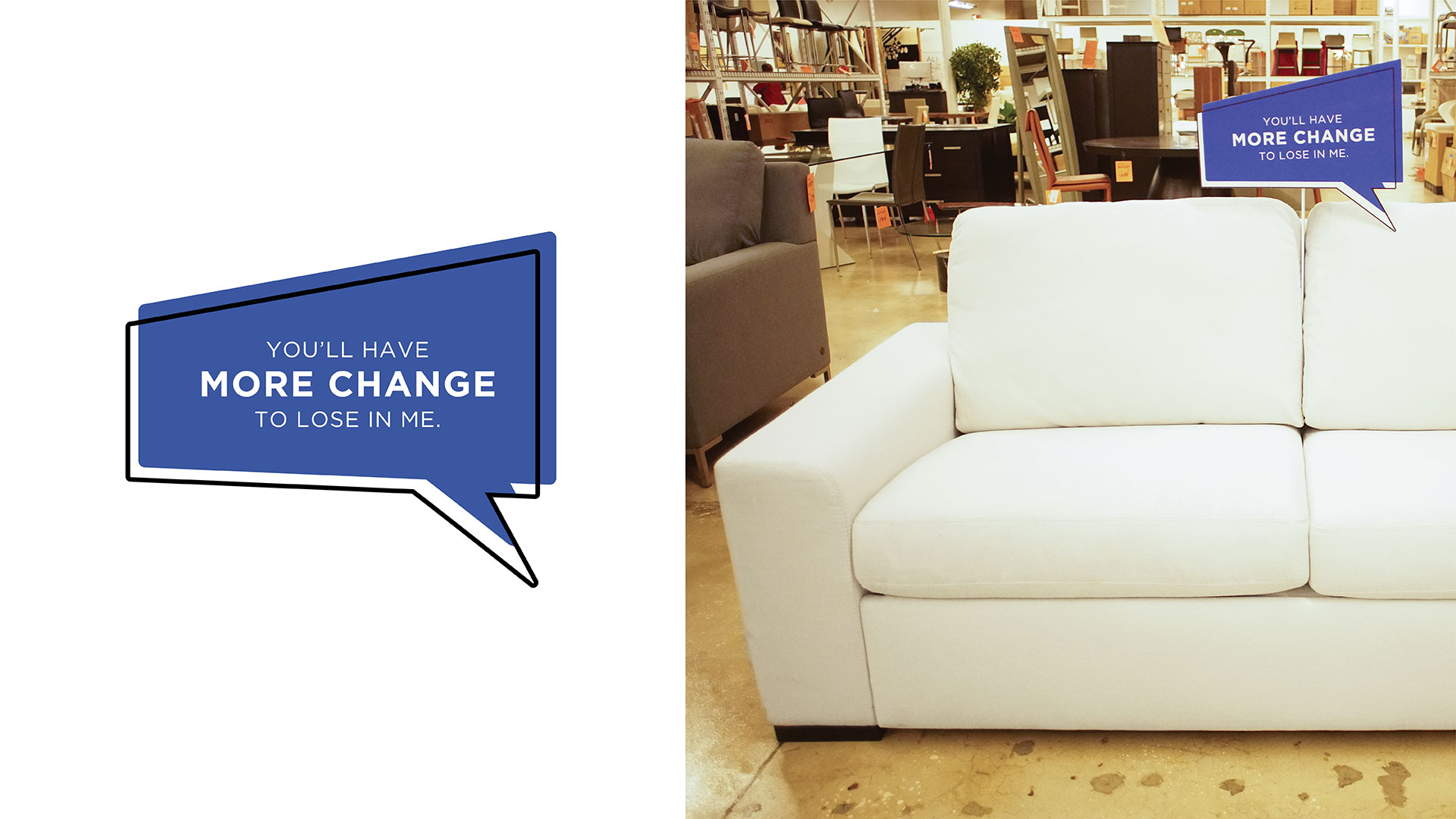
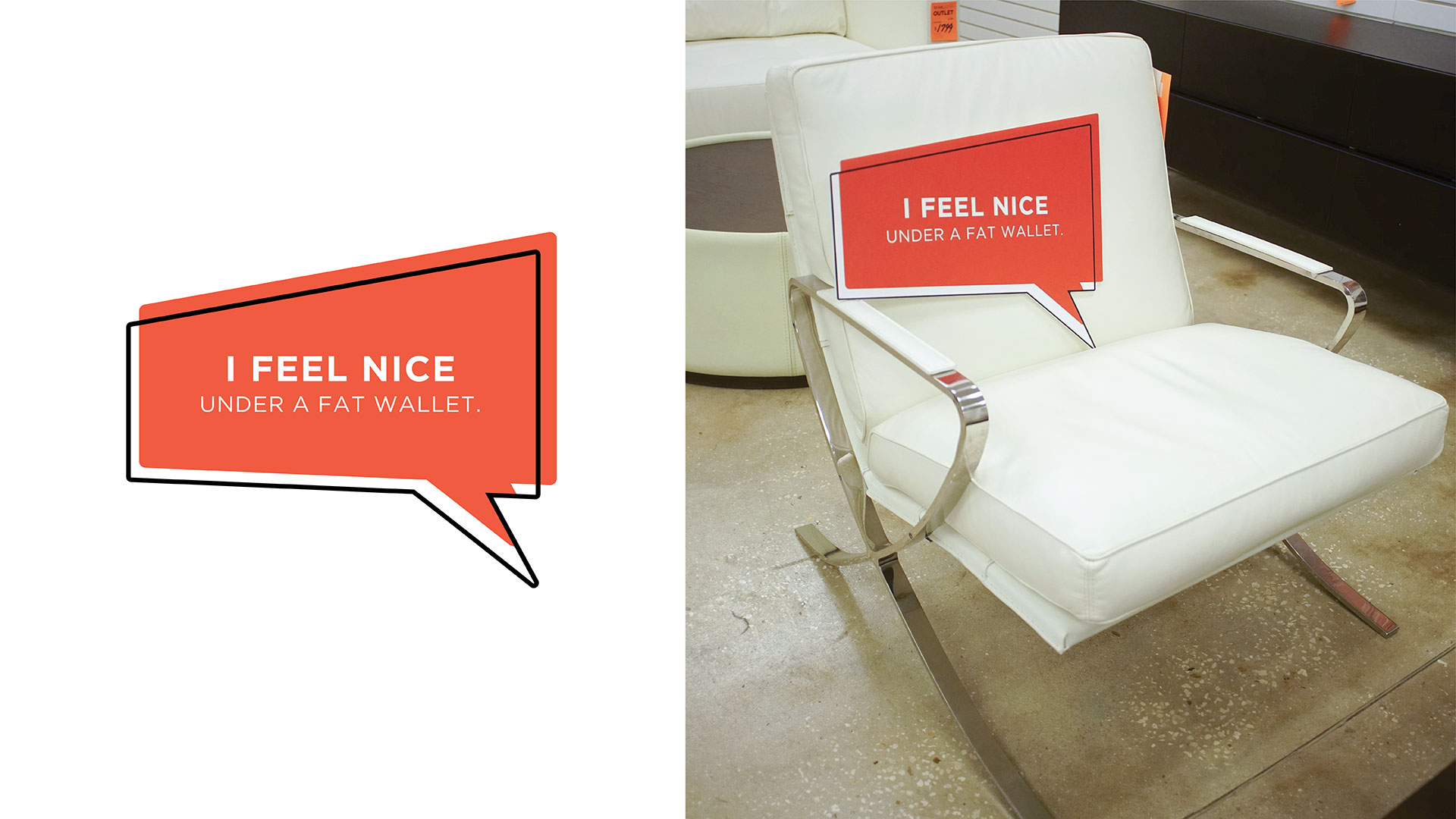
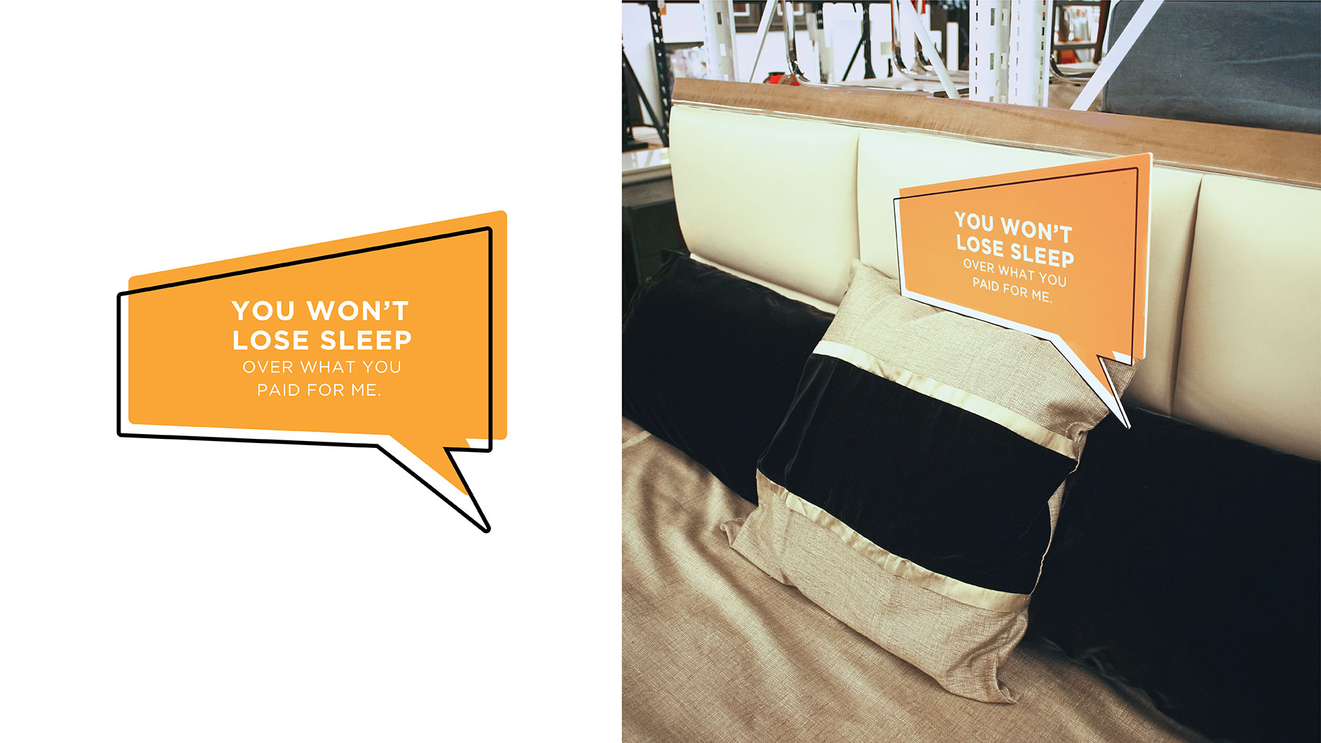
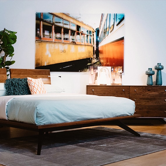
To separate the Outlet brand from that of the main, more sophisticated stores, we utilized a bold, direct tone with bright colors, geometric breaks, and full bodied, all caps typography. Placements were made in OOH, HTML, Social, Video and we extended the message all the way to point of purchase with strategically placed speech bubbles on relevant pieces of furniture that “spoke” to the customers as they were making their final purchase decisions.
